Data Collection & Telemetry
Overview
Update Hardware
Module and SIM Update Guides
Module Identification
Module Swap Wizard
SIM Swap Wizard
AT&T / T-Mobile Configuration Guide
Verizon Configuration Guide
Worldwide H1 SIM Configuration Guide
SIM Replacement Instructions
Wi-Fi Configuration Guide
Firmware Update
Troubleshoot
ZL6 Troubleshooting Guide
ATMOS 41W Troubleshooting Guide
EM60G Troubleshooting Guide
EM50 Series Troubleshooting Guide
Communication Test
List Cellular Carriers
Test Button & Status Lights
Fix: Retroactively Enable LTE-M Bands for 4G in Europe
Sensor Current Draw Check - ZSC
App Location Permissions on iOS and Android
Coverage
Accessories
ZENTRA Cloud 1.0
Quick Start
Organizations
Account
Edit Account Profile
Update Account Password
Lost Password/Password Reset
Set Measurement Unit Preferences
Users
Devices
Device Inventory
Edit Device
Re-provision ZL6 to European Server
Add Device
Remove Device
Time-zone and Location Override
Calibrations
Downloads
Dashboard
Enable Chart Status
Create Custom Charts
Color Picklist
Add Traces to Chart
Chart Stats
Print Charts
Set a Target Range
Lock Chart Axes
Chart Date Range Picker [NEW]
Download Chart Data
Notifications
Models
Daily Light Integral [1.0]
Ground Water Elevation [1.0]
Ground Water Depth [1.0]
Plant Available Water [1.0]
Daily Light Photoperiod [1.0]
Chill Hours [1.0]
Growing Degree Days [1.0]
Create a Model [1.0]
Evapotranspiration [1.0]
Subscriptions
Error Codes
Applications
FAQ
ZENTRA Field
ZENTRA Cloud 2.0
Frequently Asked Questions
Getting Started
User Account
Setup
Loggers
Add Data Logger
Configure Data Logger
Map of Data Loggers
Data Logger Charts
Data Logger Download
Logs
Archive
Handhelds
Dashboards
Explorer
Data
Workspaces (Projects)
Alerts
Environment Models
Chill Hours [2.0]
Daily Light Integral [2.0]
Daily Light Photoperiod [2.0]
Evapotranspiration [2.0]
Groundwater Elevation [2.0]
Groundwater Depth [2.0]
Growing Degree Days [2.0]
Heat Index [2.0]
Heat Stress Wet Bulb Globe Temperature WBGT [2.0]
Leaf Wetness Amount of Water [2.0]
Plant Available Water [2.0]
Utah Chill Model [2.0]
Wind Chill [2.0]
Subscriptions
Feedback
API
v3.0/4.0
US Server API
EU Server API
TAHMO Server API
Push API
R Package
API Troubleshoot
AgWeatherNet & DAS
Manage API Keys
v5.0
Metadata
Release Notes
Accessibility
Security
Uptime & Incidents
Legal
Table of Contents
Graphs
How to create and edit custom graphs.
IN THIS ARTICLE
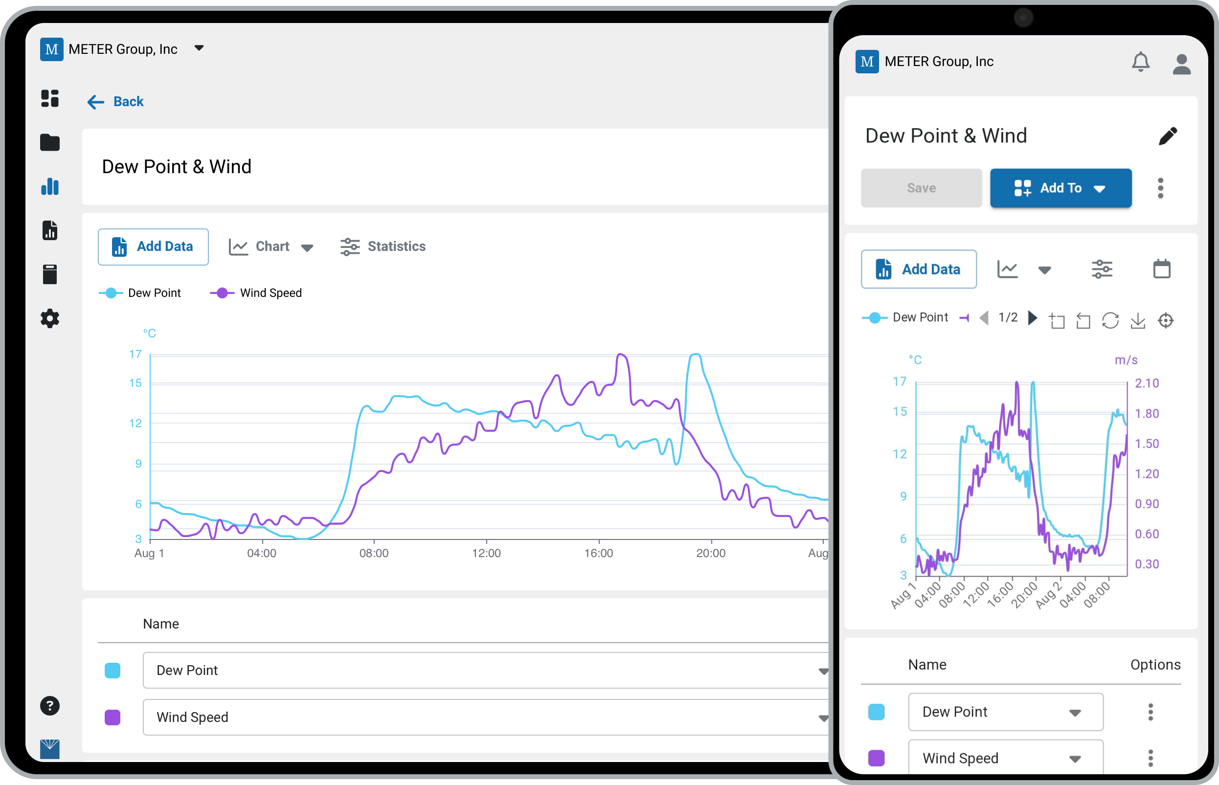
Need to build a custom graph to streamline your data analysis? The explorer helps you analyze your data with custom visualizations, including graphs, tables, and maps. Build visuals to fit your application, and then group and share them using dashboards.
≤ 14 Days → Unaggregated
≤ 90 Days → Aggregated hourly
> 90 Days → Aggregated daily
Explorer
- In the navigation menu, click Explorer.
- Click Create to build a new graph, table, or map.
- Click Add Data to open the data panel.
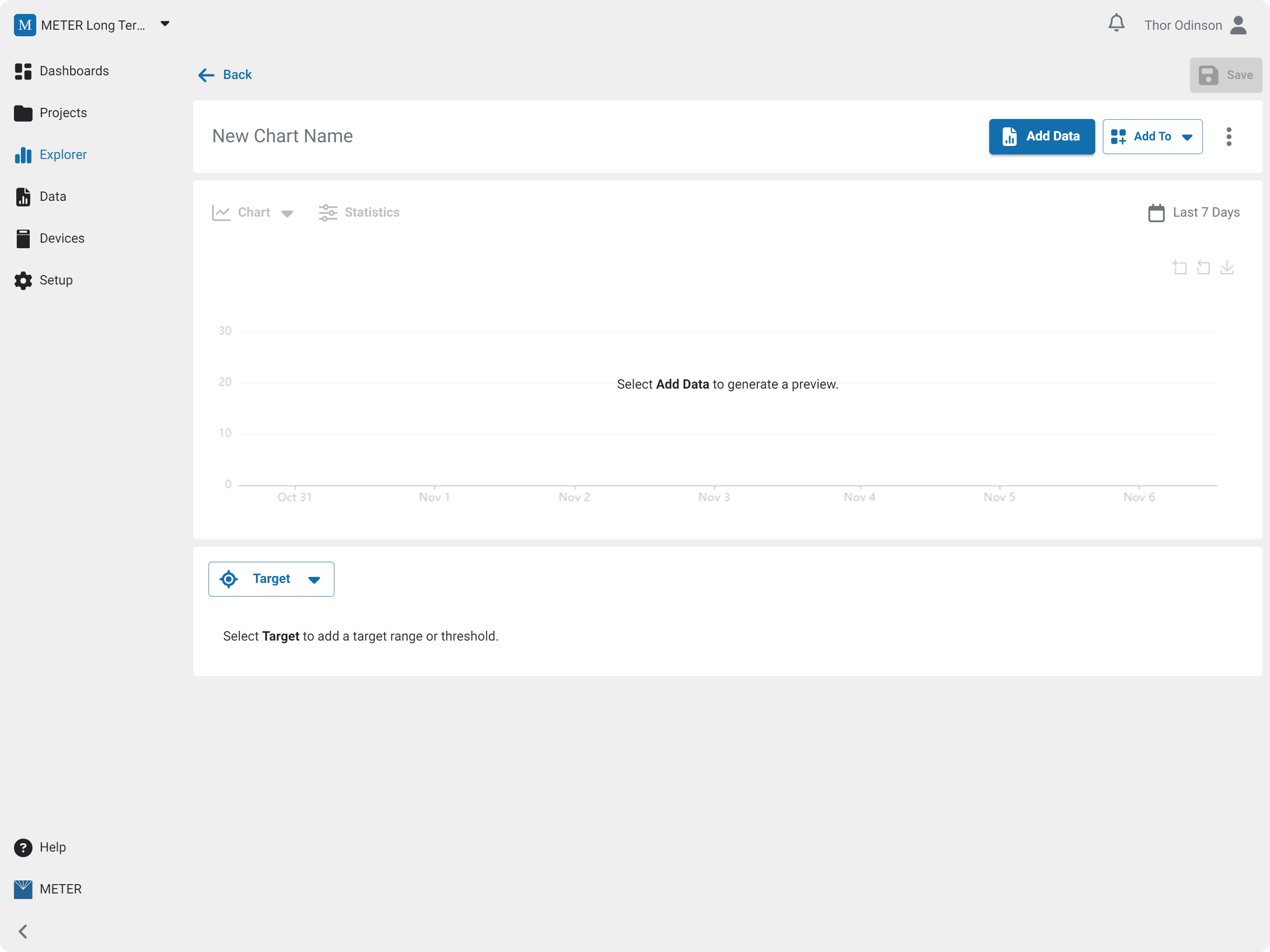
Add Data
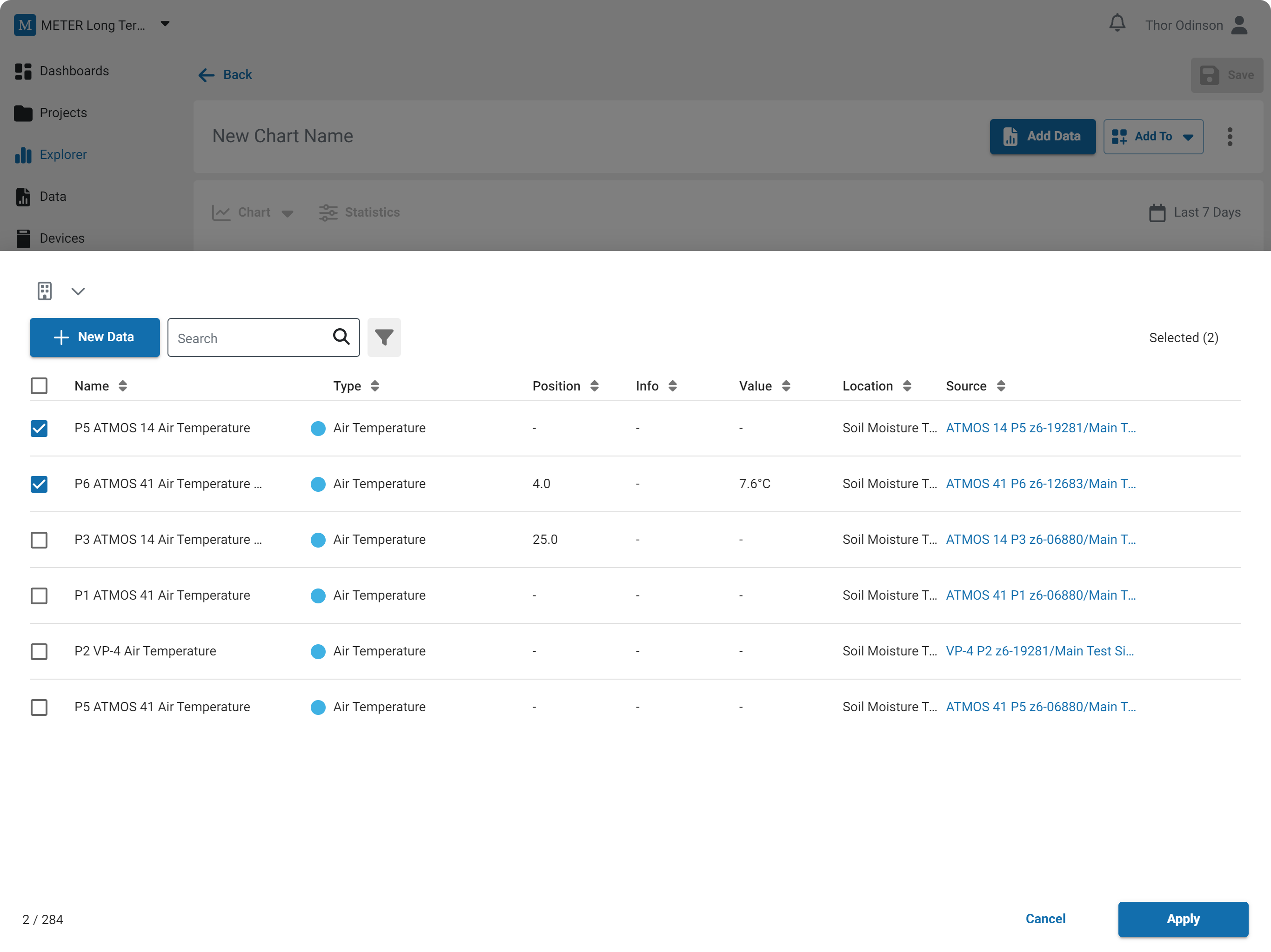
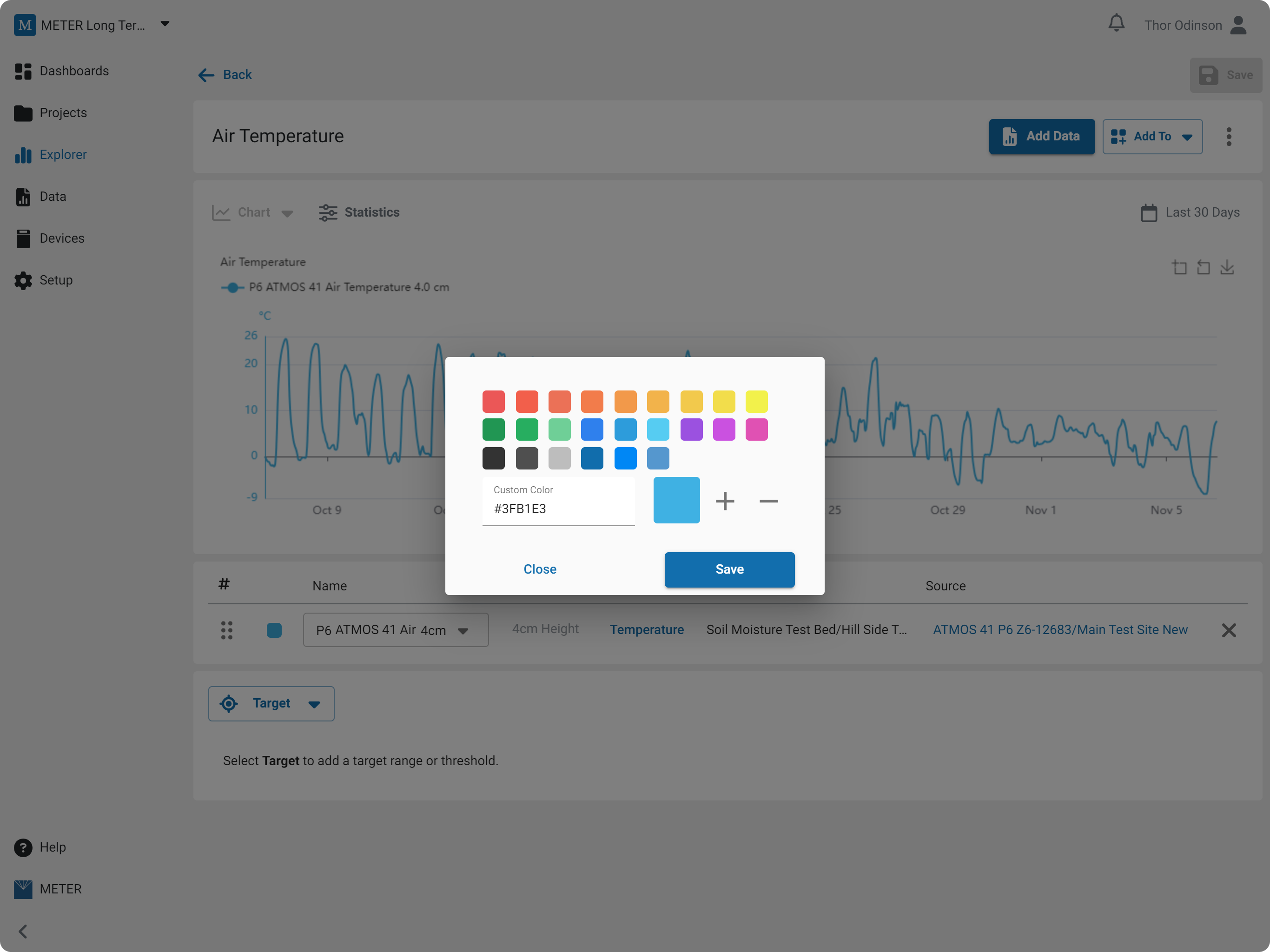
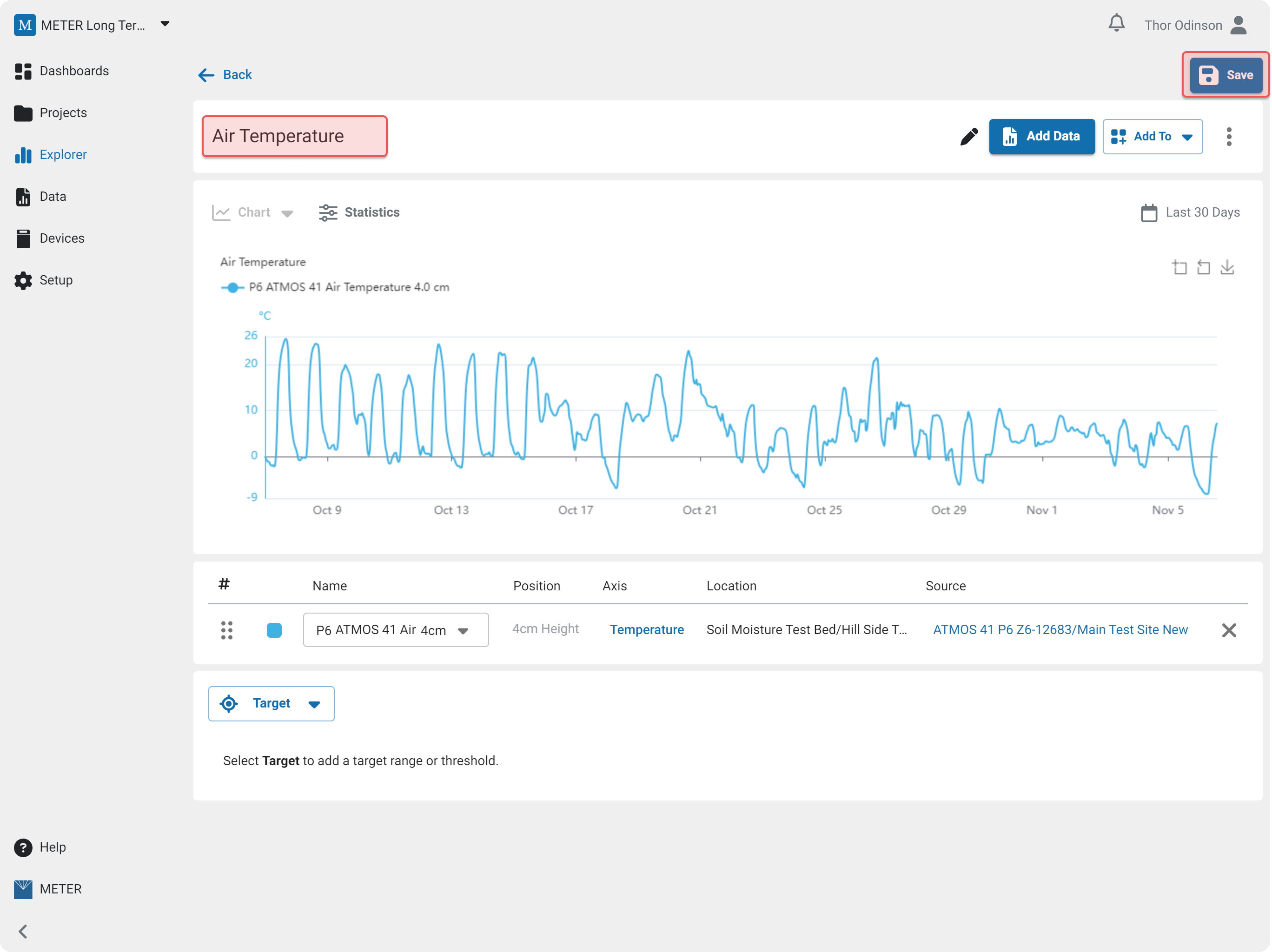
You can search and or filter the list of data. Use the checkboxes to choose the data you want, and then select Apply. The data will appear below the graph where you can edit the color, name, position (height/depth), axis, and order of the labels in the legend.
Trace Color
Select the color swatch to customize the trace color.
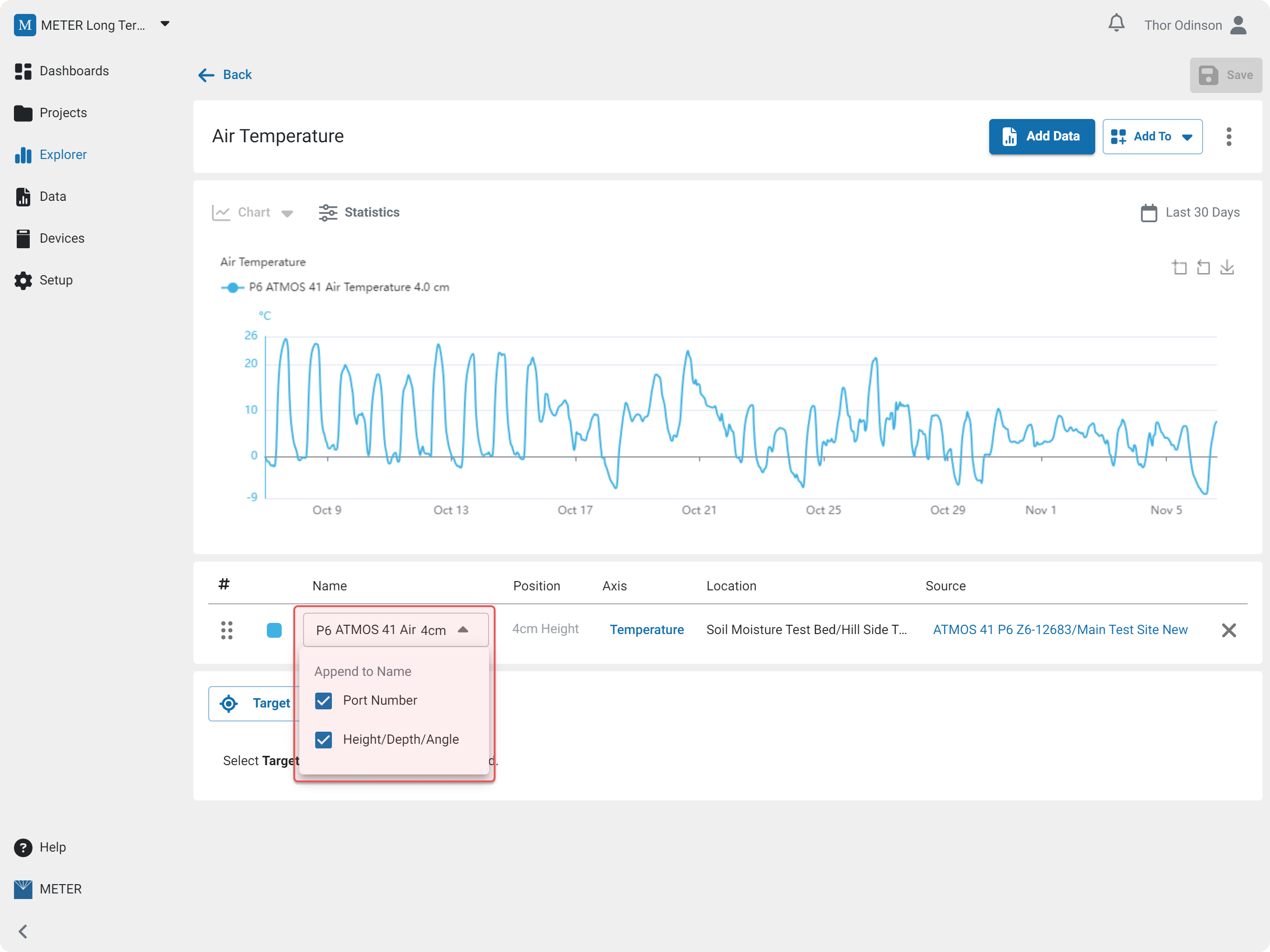
Trace Name
Edit the name. You can choose whether to append the port number and position (height/depth/angle) information to the name.
Axis Options
Configure the axis bounds, order and color from the axis sub-menu.
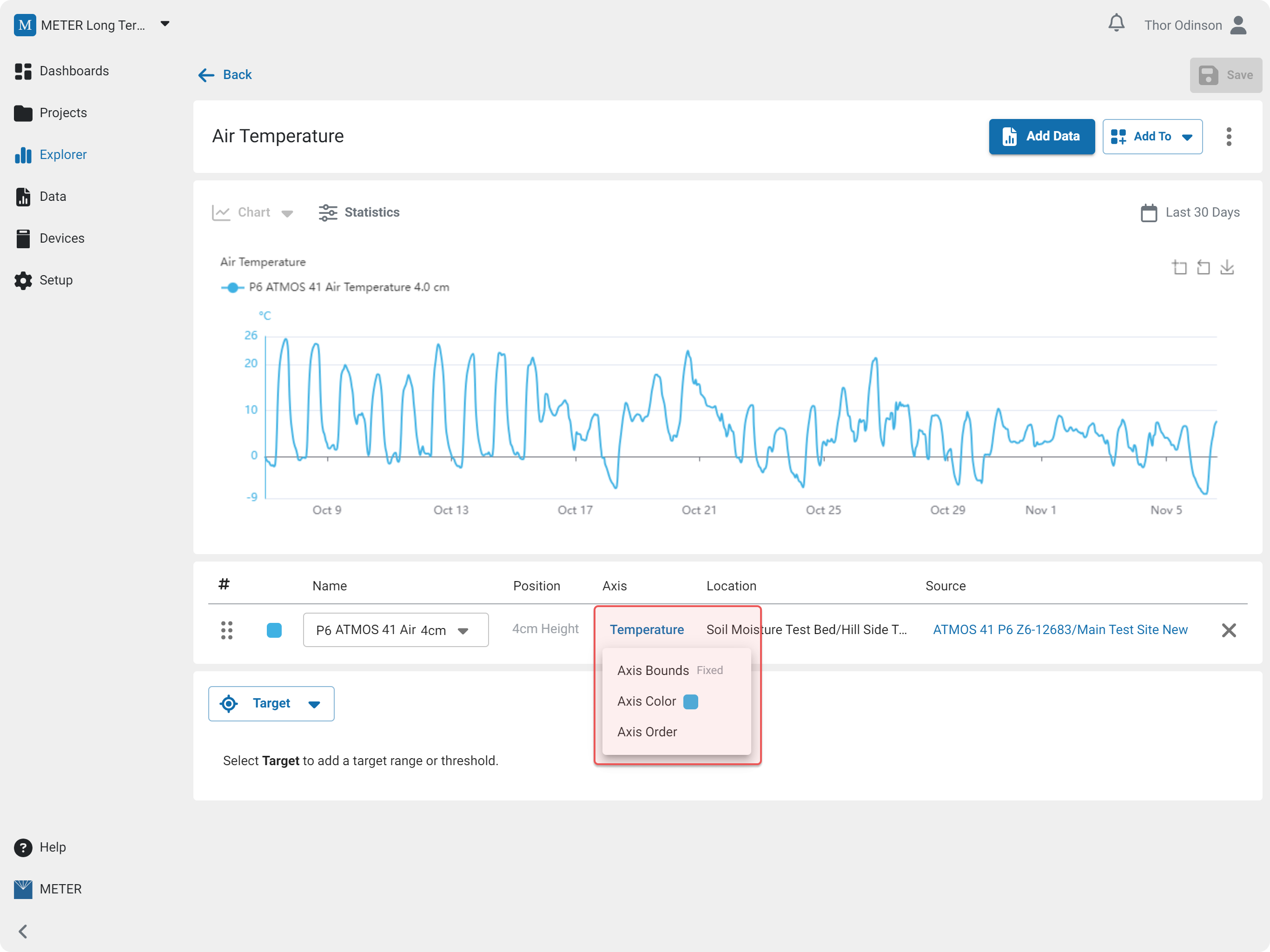
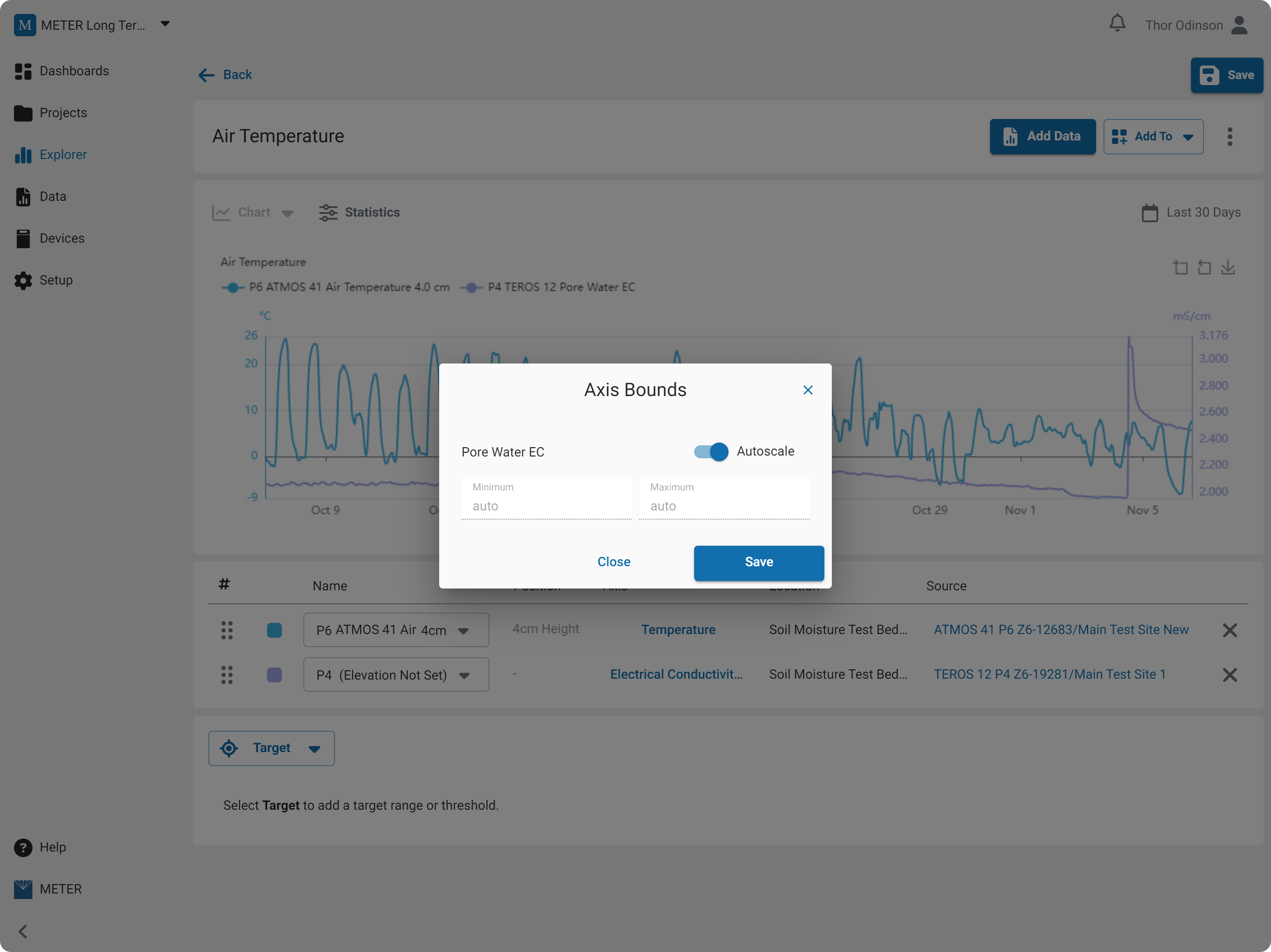
Axis Bounds
Set the axis bounds.
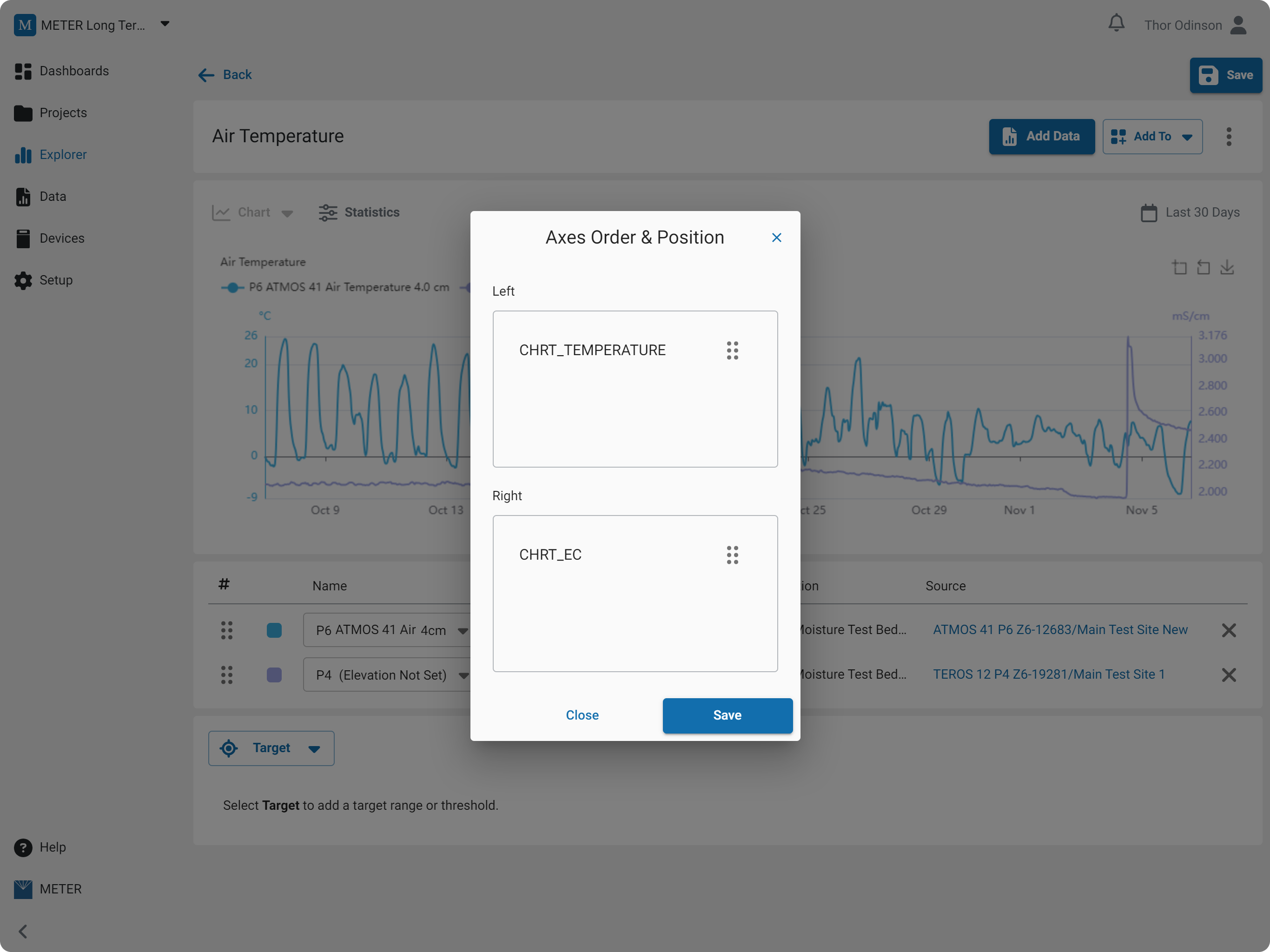
Axis Order
Arrange the axis order.
Save
To save the graph enter a name and then select Save.
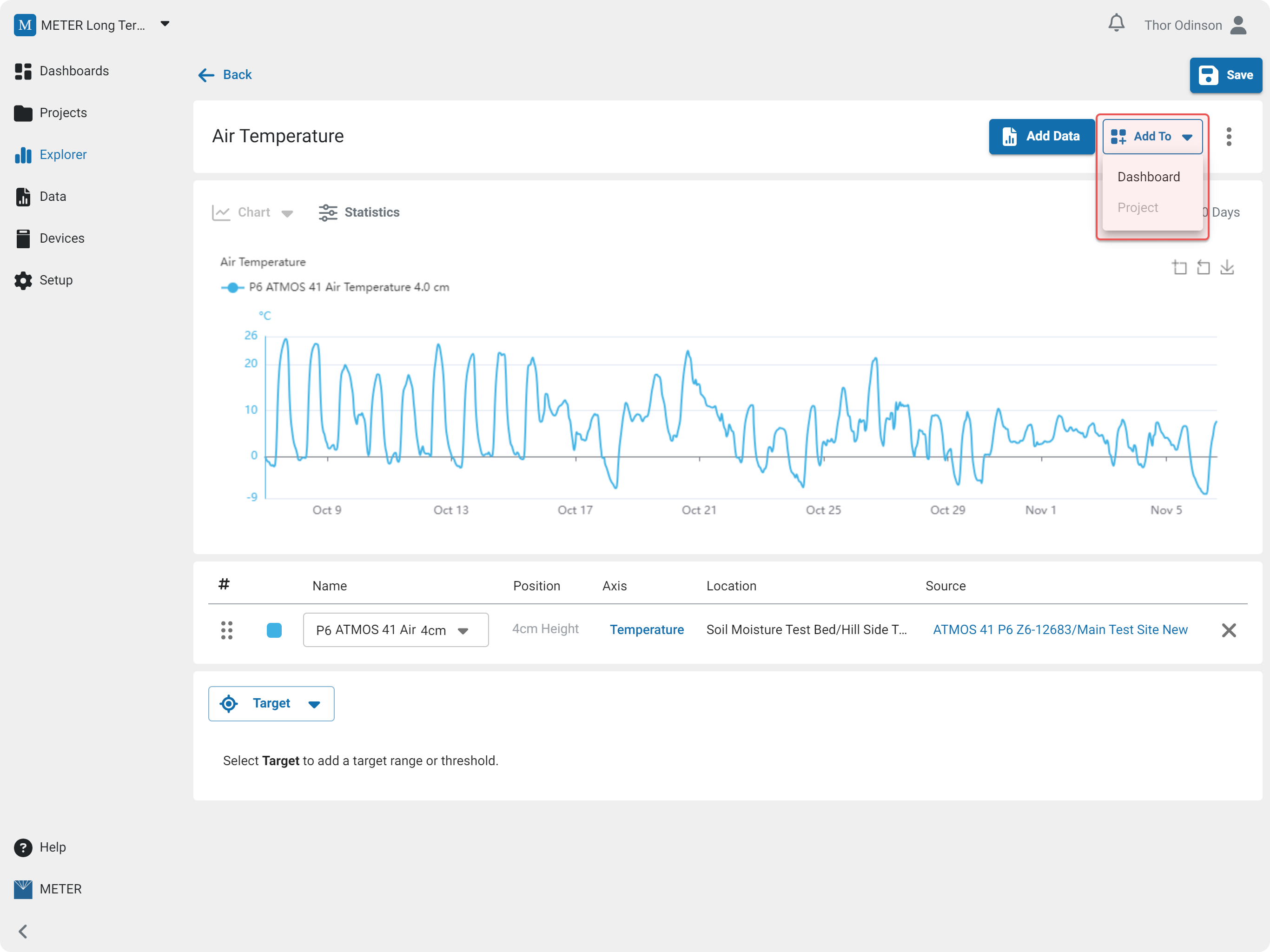
Add to Dashboard
Select Add To to add the graph, table, or map to a project or dashboard.
How-To-Video
How did we do?
Metrics